Engage App Redesign
Client: Student project at Columbia College Chicago (Senior)
Project Duration: 4 months
My Role: Researcher, designer, wireframer, prototyper
Tools: Figma, Mural, Canva, Pencil & Paper
Overview
The Engage app is the Columbia College Chicago social app where students can connect. The platform acts as a marketplace, event promoter, and social forum for all Columbia students. It’s a great way to get the word out about club meetings or students looking to collaborrate on a project, but unfortunately falls flat in certain areas.
Problem
The main issue with the Engage app was the functionality. It was frustrating to use and hard to look at due to its broken feed and confusing layout. As students of Columbia ourselves, we felt that it would be a good project for the semester.
Solution
Our team was made up of four interaction designers and one app developer. We decided it was best to focus on improving the design considering our combined skillset. The solution we came up with was to reorganize the content to make it easier to process while keeping the design simple.
Research
When we first got our assignment, we didn’t know where to start. We all had different ideas of topics that we could cover and needed to figure out which one to center on for the rest of the semester. The first thing we did was ideate. We put our ideas in one place, listed the areas that needed improvement, and came up with some potential solutions. Using this chart, we picked the project that we felt the most confident doing with the time and skill that we had. With our topic picked, we were ready to start researching.

Originals
These are the original screens at the time of the project:

Feed

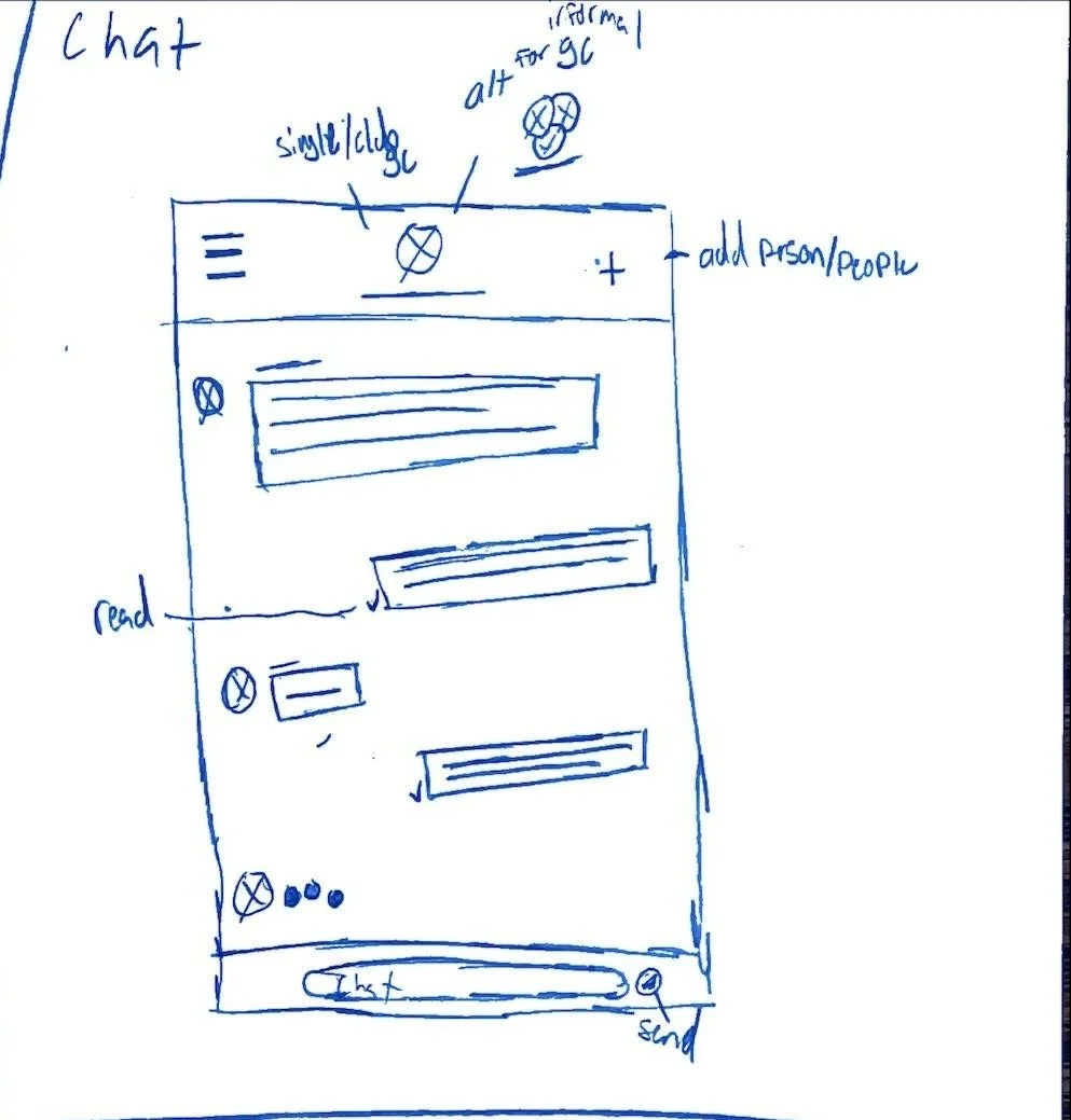
Chat

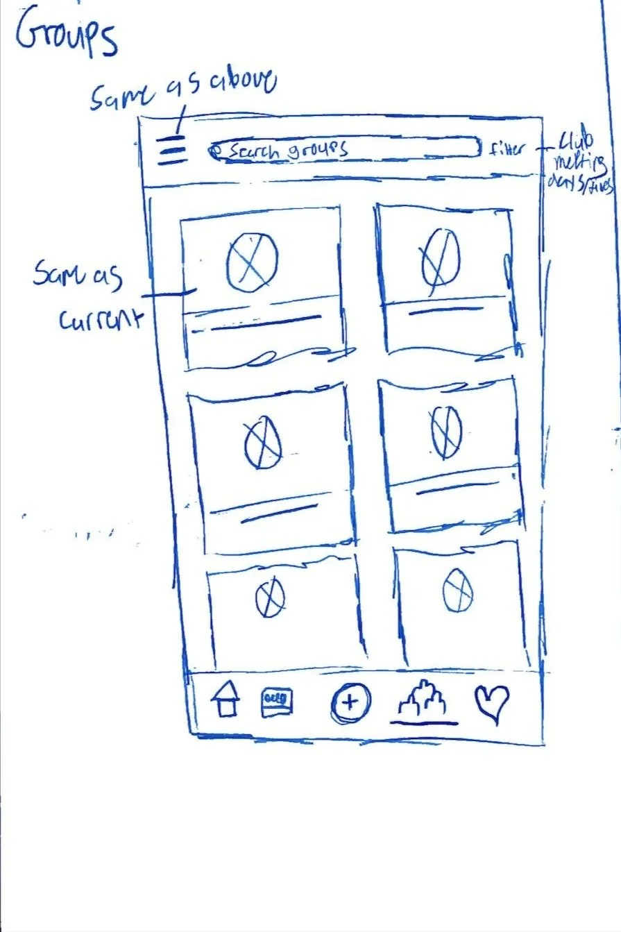
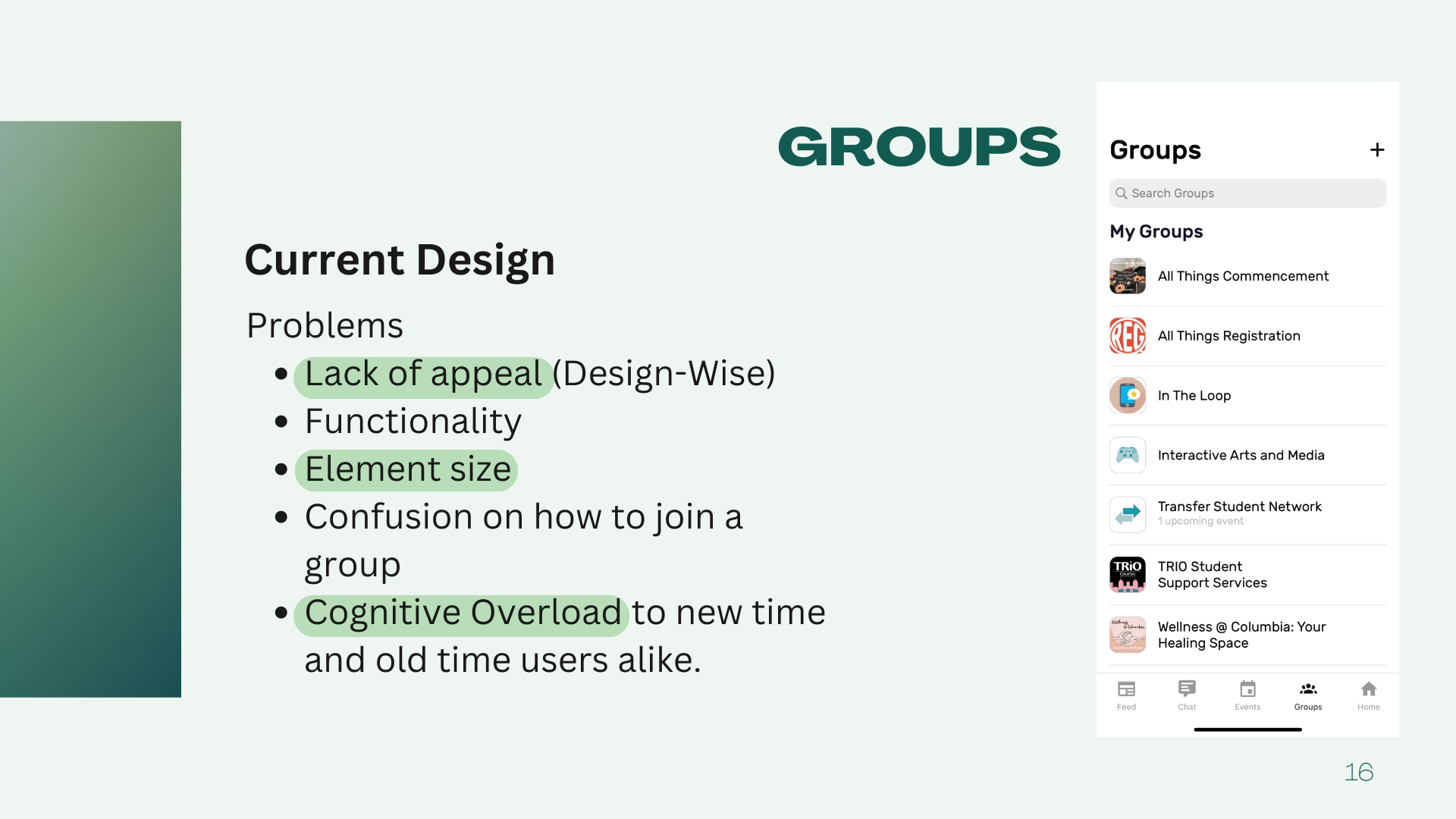
Groups
Events

Home
We noticed that the other apps had a more cohesive visual design, a feed as the homepage, and fewer features than the Engage app.
Results
After conducting our analyses, we had trouble prioritizing our main pain points. To help with this, one of our team members conducted a qualitative smoke test and usability test to pinpoint the areas causing the most frustration. From the results, we came up with six pain points and whittled them down to 3:
Poor information architecture
Too many features
Bloated visual design
Personas
Using the data collected from our tests, we put together two user personas representing our target demographics: students looking to get involved on campus and club advisors.


Competitive Analysis
Usually when starting a project, we would conduct user testing to know if what we were doing was necessary. This project, however, was a special case as we were part of our own target audience: Columbia College Chicago students. We felt we had enough firsthand experiences between the five of us and our friends and classmates (and sometimes even professors) complaining about how difficult it was to use the app that we knew that this was something we wanted to try. We conducted a competitive analysis between 5 different colleges and their student apps to get an idea of where to start.
Design
With all of our data collected and our personas created, we were ready to begin the design process. Using the pain points we found during the research phase, we picked out the screens we were redesigning: the home/feed, groups, chat, and events pages. We had two main design goals:
Refocus on the core functions of the feed, events, chat, and groups pages by cutting down the amount of content and features
Create a cohesive visual design and identity that clearly conveys function in order to foster a positive user experience
We did a quick sketching exercise to generate some design ideas for each individual page. Here are the ones I did:


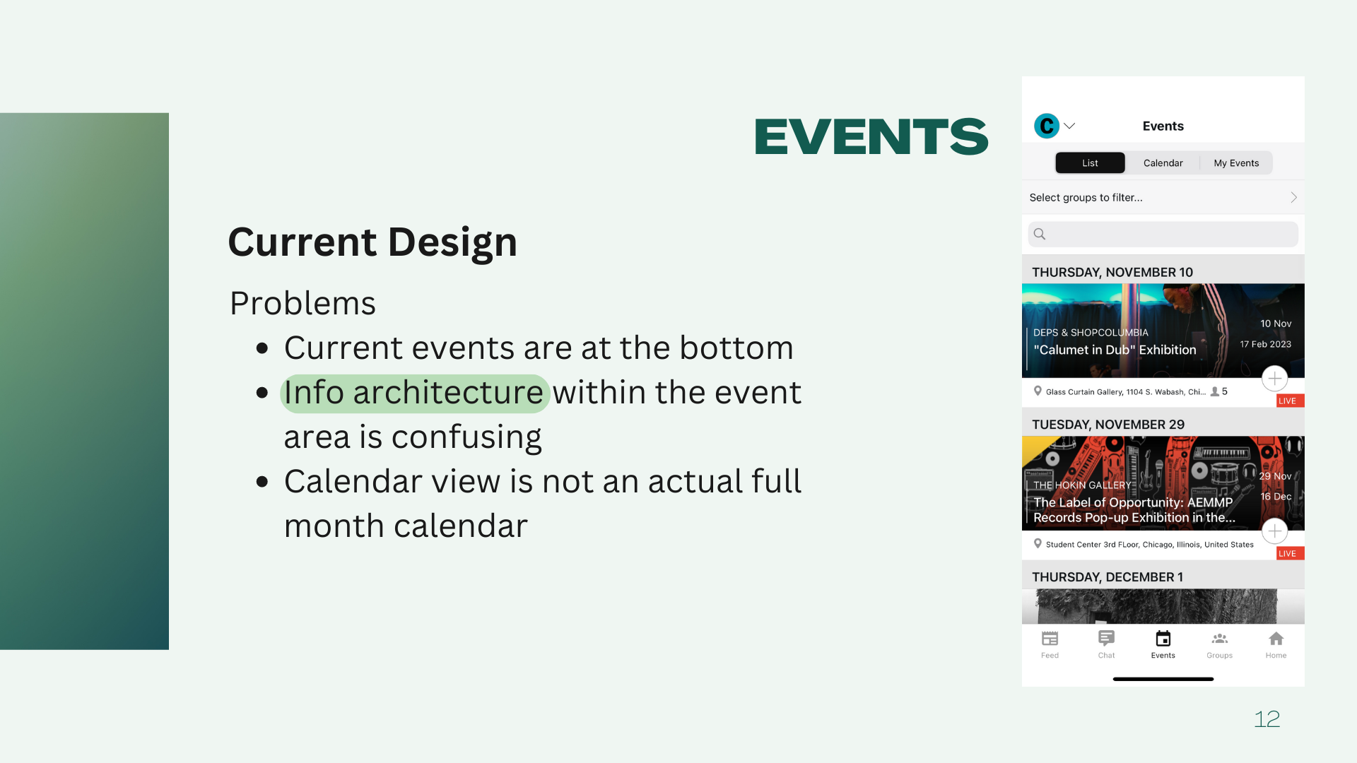
I was tasked with redesigning the events page. There were three main issues with this page:
The most current events were at the bottom of the page
Confusing information architecture
The calendar view is not a full-month calendar, but a weekly timeline at the top of the page
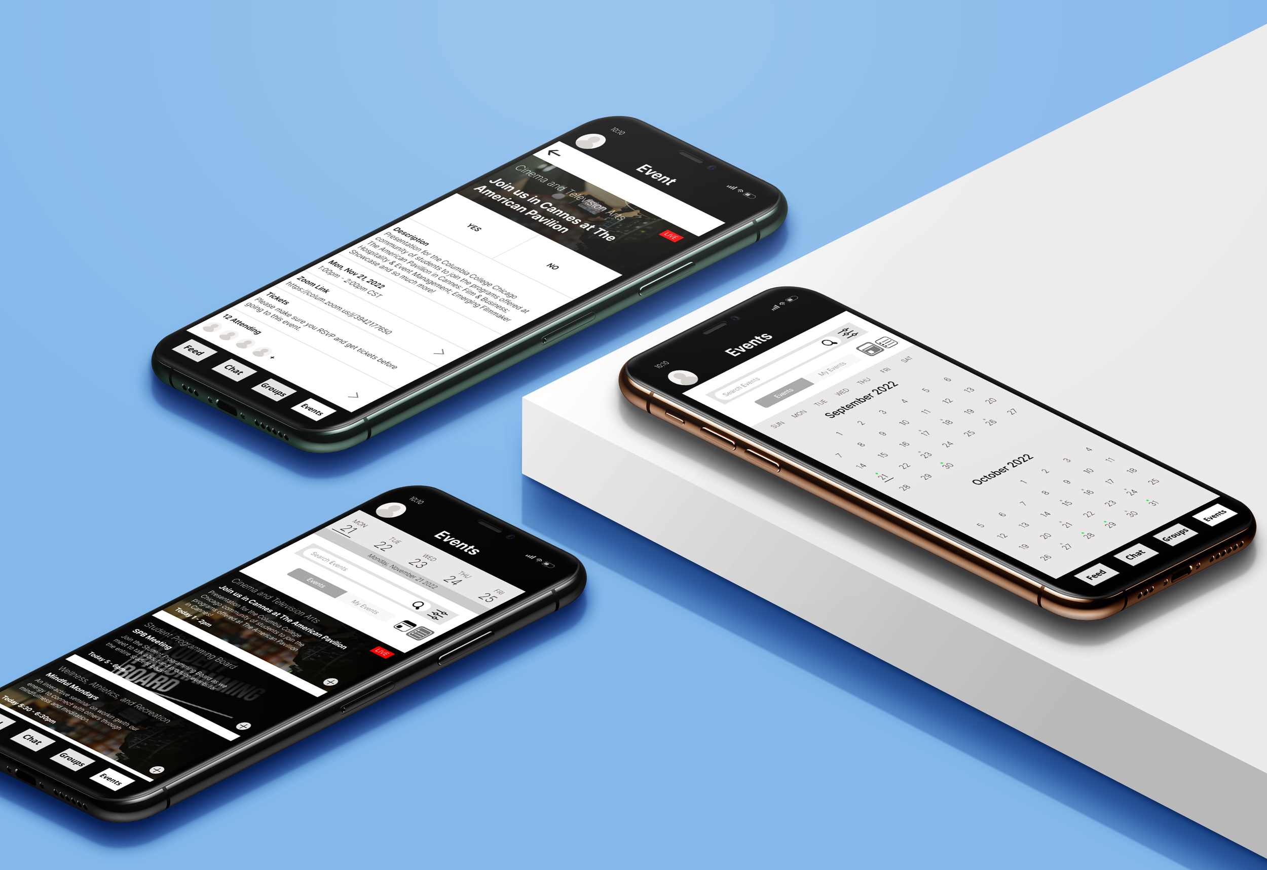
The changes I made were with these three issues in mind. My main goal was to reduce cognitive load and hopefully make these screens easier to navigate. Below are the original events screens along with my updated versions.

List View

Calendar View
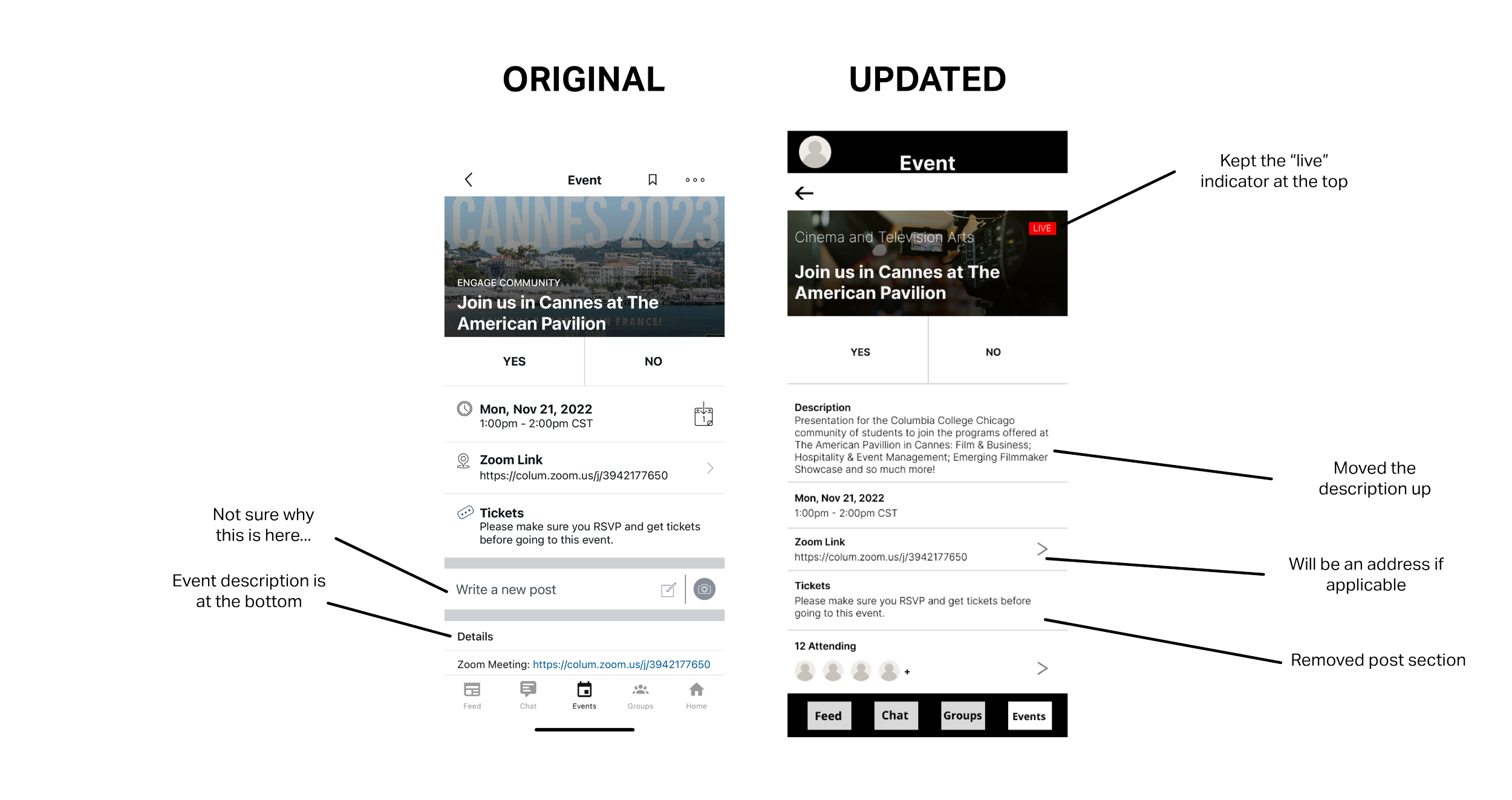
Event Info Page
The full presentation with all of the screens and edits can be found below:


Deliverables
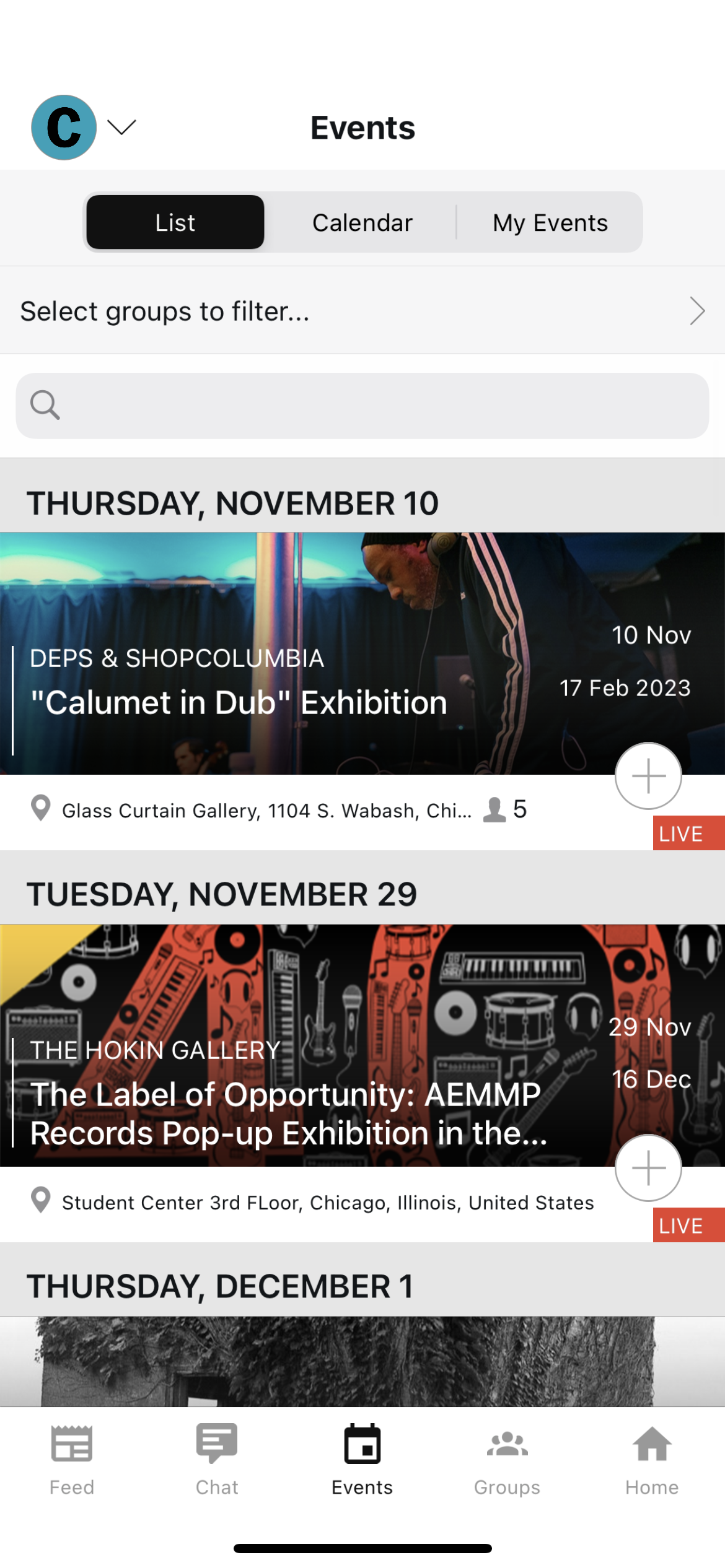
After deciding which designs we liked best, we moved to Figma to start putting them together. This was the first time I used Figma for a project like this so I was excited to learn. Fortunately, I had previous experience with Adobe XD and prototyping so I could pick it up pretty quickly. We split the pages amongst ourselves and I was assigned the events pages.
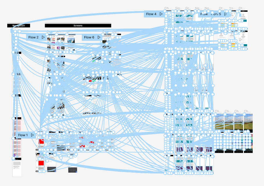
Our prototype (I love this picture)
Takeaways
My biggest takeaway from this project was learning how to communicate within a group. I’ve had group projects before, but this one felt more involved. A few weeks before starting our project, we spent time learning what makes a functional, successful team. At the core of it was communication. We made it a point early on to rely on each other when we were having a hard time so we could make the proper adjustments. Now, I make sure to give my teammates updates on my progress and check in with them to see how they’re doing. I always think back to what I learned here whenever I start to feel overwhelmed.