
Inahsi Site Refresh
Client: Inahsi
Project Duration: 3 months
My Role: Research, Web design, SEO Optimization
Tools: Shopify, Microsoft Clarity
Overview
Inahsi is a DTC haircare brand that specializes in natural ingredients. Because they run their business through their website, they wanted to update the look and feel to something cleaner and easier to use, not only for their customers but for themselves as well.
Problem
The site was getting too complicated for both front-end and back-end users and was in need of reorganizing.
Solution
Using data collected from both Shopify and Microsoft Clarity, I found major problem areas and adjusted them accordingly, increasing the conversion rate by 21% (as of July 2022).
Research
Although there was a general understanding of what the problem was, I wanted to see what the numbers had to say. Using Microsoft Clarity, I looked at heatmaps from multiple areas of the Inahsi site, primarily the home and cart/checkout pages. I wanted to see what visitors were gravitating towards and where they were having issues. Here is a heatmap of the desktop homepage from that time:

The clickmaps below provide more evidence as to where the user traffic is most concentrated.

Here at the top, we can see the areas that get the most traffic.

But as we go lower, we lose a lot of that traction. Even still, the products hold the users’ interest.

This far in we’ve lost almost all visitors, but the reviews hold some attention.
From the heatmaps, I was able to see some trends across the site:
In 30 days, only one person clicked the “sizes” tab and no one clicked the “wholesale” tab (the “shop” tab was the most popular)
The products are what people want to see
Over 50% of users are lost after the first image and 70% by the second
What this told me was that visitors are very much interested in the product, but not so much the additional information on the majority of the homepage.
Some observations I made as a result of these analyses:
Simple navigation with minimal tabs
Home page is on the shorter side with a focus on product photography
Reviews are shown on the home page
Items are categorized by function and/or product line
Combining the data from the heatmaps and the competitive analysis, I put together a proposal to clean up the site with the goal of improving overall user experience.
Competitive Analysis
After collecting data from the heatmaps, I knew where the issues with the site were and wanted to see some examples of better implementations. I conducted a competitive analysis against 3 different haircare brands that are also based online: Ecoslay, Caniivy, and Briogeo. I prioritized navigation and item selection since those were the main issues with the Inahsi site.
Design
After going over the data I collected from Microsoft Clarity and the competitive analyses, I came up with some goals for the site improvements:
Simplify the navigation
Remove filler from the homepage
Consolidate the items pages
Navigation
The navigation was the top priority, so I started there. What I noticed immediately was that it was hard to find individual products. Some are listed here, but most are not. There were no categories so the shop tab became a mixed bag of site pages with repeat information.

Before
I reorganized the shop tab to keep similar information in one place (collections in the collections section, sizes in the sizes section, etc.). Users can now access the product they want in one to two clicks instead of digging through the site to find it.

After
Home Page
From the heatmap, I saw that although there was consistent user interaction with the product, the two areas with the large images were largely ignored. I decided it was best to delete them to give the other sections (reviews and best-selling items) a better chance.
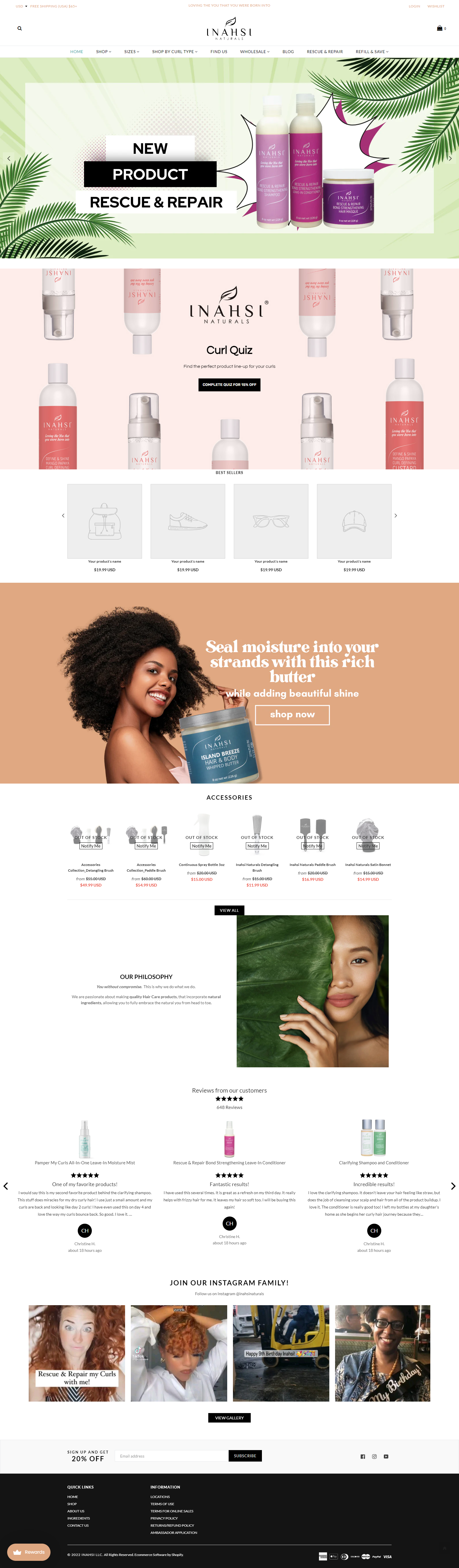
Before

After
Items
On the old site, each size variant of a single item was listed as an individual product, cluttering the shop pages. I sorted the items and put them in their proper collections, giving each bundle its’ own page and each individual item a set of size options to keep everything together.

Takeaways
This was the first project that I proposed and executed. It was also the first project I completed that wasn’t school related. People would actually use this website when I was done. Knowing this really motivated me to make every change intentional, so I looked at as much data as I had access to and made decisions based on it. Seeing the results in the months after helped me gain confidence in my work. It was especially great seeing some reviews come in saying that the site was easier to use.